How to Use Scatterplot Quadrant Analysis with Your Web Analytics Data
Sep 11, 2012
In web analytics, we frequently use data tables to analyze and identify problems or opportunities in our data. When you’re analyzing and comparing a limited set of values (e.g., browser types, top 25 pages), a tabular report may be all you require. However, if you need to dig deeper than the top 50 results, it can be difficult to pinpoint potential areas of focus when you’re staring at a much larger data set. For example, a data table can be unwieldy if you’re analyzing your external keywords which have an extremely long tail (thousands of search phrases).
Scatterplot analysis can be useful for any web analytics report where you have a high volume of different results (high cardinality)—keywords, internal search terms, pages, products, etc. Regardless of what type of data you’re analyzing, you will want to focus on a volume metric (page views, visits, visitors, searches, etc.) and a rate/ratio metric (conversion rate, bounce rate, AOV, revenue per visit, etc.). Depending on how many values are in a particular report, you might need to set a minimum threshold or cutoff based on your volume metric (only pages with more than “x” visits) because you want to focus on items that when optimized will have a material impact on your business. Wasting time on optimizing a poor-performing landing page that only receives 19 visits per month most likely isn’t going to move the dial.
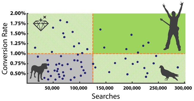
Once you create your scatterplot graph, you can then divide up the scatterplot into four quadrants to form a two-by-two matrix. With your volume metric on the X-axis and your rate metric on the Y-axis, you can create the quadrants by adding lines for the average for each metric (or some other reasonable benchmark). The contrasting attributes of each quadrant will mean you’ll want to approach each one differently. For example, if you were analyzing your site’s internal search terms based on searches and conversion rate, you would have the following quadrants:
Rock stars (high volume, high converting): These search terms are important to your business and demand your attention (no brown M&Ms). You want to ensure these search terms continue to be successful and explore ways in which they can convert at an even higher rate.
Hidden gems (low volume, high converting): This group of shiny search terms might translate into some opportunities to target less-competitive, high-performing keywords in your external paid search campaigns.
Pigeons (high volume, low converting): This flock of search terms might not leave a pleasant impression on your site. However, for internal search purposes, this quadrant could yield several promising optimization opportunities. Small improvements in the search experience can generate higher conversion rates that drive additional sales.
Dogs (low volume, low converting): You’ll probably want to stay away from these critters until you’ve exhausted all of your optimization opportunities in the other quadrants.
When you’re combing through row after row of data, it can be hard to isolate specific items that need to be addressed. By visually putting the data in separate quadrants, you can then tackle a set of items that share common traits or attributes. It also helps to keep you focused on what’s really important and meaningful to your business (i.e., don’t focus on the dogs). You don’t want to be sidetracked by anomalies in the data that pique your curiosity but are relatively insignificant or unimportant.
Scatterplot quadrant analysis is an exploratory starting point in your analysis process. As you investigate individual data points you’re going to uncover new insights that will spur further analysis as you drill deeper into the data. Bubble chart analysis is another variation of scatterplot with the size of the bubbles representing a third dimension or metric (e.g., revenue). With bubble chart analysis, you can also leverage two-by-two matrices in order to prioritize and organize your analysis focus.
Step-by-step example
Let’s pretend you have a website that sells hockey pucks, and you’d like to focus on how you can maximize your product sales. For illustrative purposes, we’re going to limit the data set to 30 products, but the approach would be the same if there were 30 or 30,000 products (although the scatterplot would be much busier). You decide to focus on two metrics: product views (a volume metric indicating how frequently a product detail page was viewed) and conversion rate (a rate metric indicating how often product views contributed to a purchase). Once you’ve downloaded the data into Excel, and you’re ready to create a scatterplot graph.
1. Create a Scatterplot in Excel
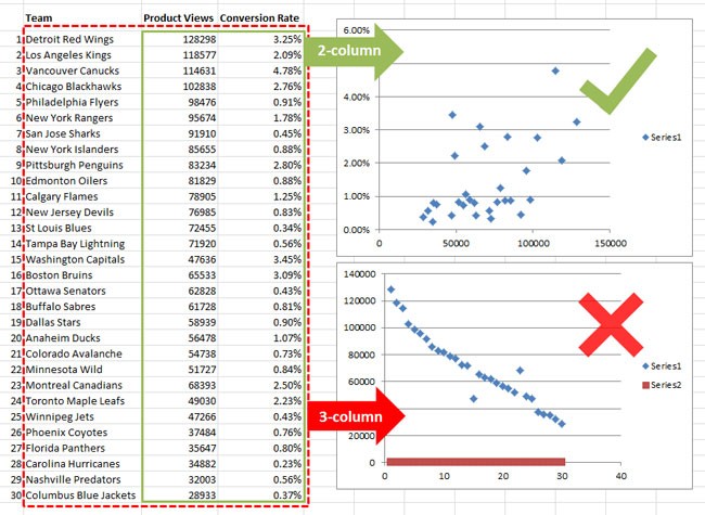
Intuitively, you would think that you’d select the three columns (product name, product views, and conversion rate) to create a scatterplot graph in Microsoft Excel. However, Excel expects you to select only the two data columns that represent the X and Y coordinates of each point in your scatterplot. It doesn’t accept a third field for the product name, which would become the data label for each point. We’ll revisit this deficiency in step 3.
2. Overlay the quadrant lines
Now, we want to overlay the lines that make up the quadrants. First, you need to determine where you’re going to place the vertical and horizontal lines that will create the quadrants. You can use the averages of each metric on your axes (or whatever is appropriate for your analysis). In this example, I’m going to use 70,000 product views and 2.0% conversion rate for my quadrant lines. In order to insert the quadrant lines in Excel, you have two options. First, you simply use the Shape tool to draw the lines on the scatterplot. This quick-and-dirty approach won’t be as effective if you need precision or anticipate having to resize the chart frequently.
Alternatively, you can build the quadrant lines right into your chart. You’ll need to create two extra XY data series (one for each line) and add them to the primary axis. The vertical XY data series will have your average volume metric in the X column and the min/max of your rate metric’s axis in the Y column (the min and max will come from the current y axis). The horizontal XY data series will be the opposite—min/max of your volume metric’s axis in the X column and the average of your rate metric in the Y column. If you right-click on your scatterplot, click on Select Data and add the two additional series.
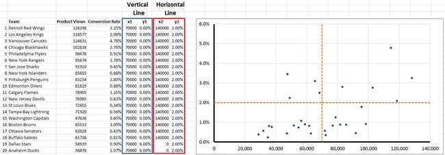
Add two XY data series for the quadrant lines.
Once you’ve added them, you’ll want to edit the data series for each line (right-click on a data point). Remove the marker, change the line color (change “no line” to “solid line”), choose a different color, and edit the line style (if you want a dashed line instead). You’ll also need to adjust the axes as Excel will automatically extend the length of each axis. If you right-click on an axis, under Axis Options you can change the axis maximum to Fixed with the value of the max that you used for each metric.
3. Isolate data points to investigate
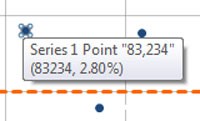
When you hover over a point in Excel, you’ll see a pop-up similar to this one.
You have your scatterplot with the quadrant lines in place, and you’re ready to start exploring the data. When you hover over a particular data point of interest with your mouse, you get an annoying pop-up similar to this in Excel:
Series 1 Point “83234”
(83234, 2.80%)
Because Excel doesn’t allow us to assign a data label to each point, it’s difficult to understand which data points correspond to which products. I can use the X (83234) and Y (2.80%) coordinates to cross-reference a product in my data table, but a manual look-up approach can be tedious and problematic if I’m looking at a scatterplot with hundreds or thousands of data points. This longstanding issue in Excel has never been addressed by Microsoft, but there are a couple of free add-in hacks available.
Rob Bovey’s Chartlabeler: www.appspro.com
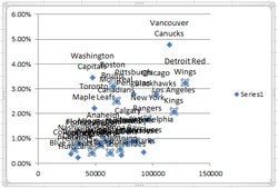
This labeling mess is with only 30 values. Imagine 30,000 values…
This add-in tool will allow you to add labels to your data points, BUT depending on the spread of your data points the labels may be rendered unusable because they stack on top of each other. The add-in is fairly straightforward to use but the overlapping labels means this add-in won’t work in most cases. According to Excel expert, Jon Peltier, this add-in functionality will be built into Excel 2013, but it still won’t overcome the problem of overlapping when you have dense labels.
Tushar Mehta’s Hover Chart Label: http://www.tushar-mehta.com/excel/so…bel/index.html
This add-in tool provides a label only when you hover your mouse over a particular point, which is important when you’re trying to isolate a single point in the scatterplot. Unfortunately, this add-in is not very clear or user-friendly, but it’s really the only passable solution. It basically puts a 1 pt. font label beside each data point which generates a larger label when you place your mouse over a point. In order to get the label hover feature to work, I found I needed to first set the data labels and then set the hover action.
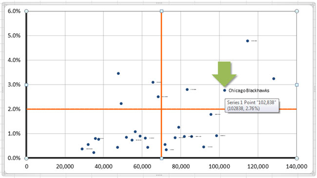
With this add-in, you hover over the Chicago Blackhawks data point and only that label shows up (although you still have the stupid default hover pop-up show up in Excel). You can see the 1 pt. font labels to the right of the data points.
4. Assign data points to quadrants in data table (optional)
A reader asked me how he could prioritize or rank items that fall into a particular quadrant. Once you’ve determined what the vertical and horizontal lines are (in this example, 70,000 product views and 2.0% conversion rate), you can assign the different items to a quadrant segment. Here’s the formula I used to assign the different products to a quadrant segment (cells C5-E5):
C5: 128298 (product views)
D5: 3.25% (conversion rate)
E5: IF(C5>=70000,IF(D5>=0.02,”Rockstars”,”Pigeons”),IF(D5>=0.02,”HiddenGems”,”Dogs”))
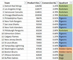
If needed you can specify which products belong to which quadrants (color-coded column on far right) and then use filters to sort and prioritize them.
If you run through the formula logic, you’ll see that the cell E5 will be assigned to the Rockstars segment. Once you’ve used this formula to assign each data point to a quadrant, you can then apply a filter (Data > Filter) to the data columns to isolate a particular quadrant and then sort it by either metric. You can then use this filtered list to target your analysis and optimization efforts within a particular quadrant.
As I mentioned before, you can use this type of analysis in lots of different places as it has multiple applications. Two-by-two matrices have been used by management consultants since the 1960s. In web analytics, they come in handy with reports where you have high cardinality (keywords, internal search terms, pages, products, etc.). Rather than being paralyzed by a high volume of unique values, you can use the quadrants to divide and conquer your data. Good luck!
Thanks to Jon Peltier at Peltier Tech (a great resource for Excel charting) for his help with this blog post.